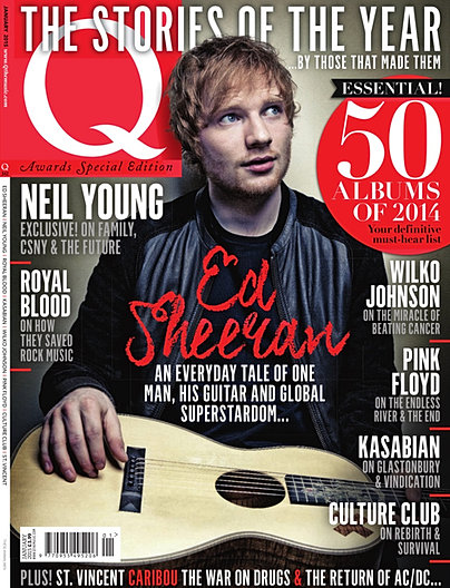
The example I found of this would be Q. Q has a demographic that caters towards a primarily male audience, and in recent years they have been around the pop genre. so I looked through different front covers from Q and I found different covers that I liked the design of.


As it can be seen the ones i liked best followed a design set.
All of these covers show male artists that are in and around the genre of Pop music, this showed what me what a successful pop based magazine would look like.
as you can see looking at these compared to mine you can see how they have inspired me in designing my own.

this was what inspired me when choosing my location and the pose I wanted my model to do during the photo shoot.
I was also heavily inspired when doing my photos by an artist by the name of KDrew and one of his album covers.

in contrast with mine...


obviously as I have stated I aimed my target audience at 15-22 year olds this means that they would be technophilles. to represent this in my contents page where I reference at a Facebook, Twitter and Spotify page.

i also reference at a Synth webpage in my double page spread.

overall i feel i created an accurate representation of my audience when working on my magazine.
No comments:
Post a Comment